Why Editorial Style Images Beat Decorative Graphics in Blog Posts
Picture a post on configuring Google Indexing API service accounts that opens with a stock photo of a laptop beside a cup of coffee. Now picture the same post opening with an image of the actual service-account setup flow.
Only one of those images tells readers they landed in the right place. That gap is why editorial style blog images beat decorative graphics: they do work the text needs done.
Every post needs a visual, and on a tight publishing schedule, grabbing something fast feels reasonable. This guide shows you how to tell useful images from filler.
Below, you will find why editorial images work, a four-question audit you can run on any image, a matrix that matches image types to article types, and an automation workflow. You will also learn the one question that exposes most decorative images, and why most teams never ask it.
Editorial images carry or support an article's specific claim, like a screenshot of the exact setup step being explained. Decorative graphics are interchangeable visuals with no content role, so they could sit on any post unchanged.
Why Are Editorial Style Images Better Than Decorative Graphics?
Editorial style images are better because they reinforce topic relevance, support the article's specific claim, and signal effort, which builds reader trust. Decorative graphics add page weight without adding meaning, so readers learn nothing from them.
An editorial image is a visual that carries or supports the article's specific claim. A decorative graphic is an interchangeable visual with no content role. Art direction is the set of written decisions about subject, framing, palette, and restraint that keeps a site's images consistent.
Think of a cookbook. A photo of the finished dish beside its recipe shows what you are aiming for, while the same generic kitchen photo on every page tells you nothing about any recipe.
The editorial look does not come from expensive gear or exotic locations, an idea the Juansuponatime video title "What Makes Photos Look Editorial? (It's Not What You Think)" also points toward. For blog images, it comes from three traits: subject relevance, meaning the image shows the article's actual topic; intent, meaning it exists to clarify a specific point; and restraint, meaning it leaves out clutter that competes with that point. A fourth trait, consistent treatment, means every image follows the same palette and framing rules, so readers recognize your visuals as one deliberate publication rather than a pile of unrelated downloads.
These traits also support image SEO, because on-topic visuals with descriptive alt text give search engines clearer page context.
BloGoose creates images alongside each drafted article, but these principles apply to any workflow. Before auditing your own posts, review the generic AI blog image mistakes already catalogued.
How to Run the Swap Test on Any Blog Image
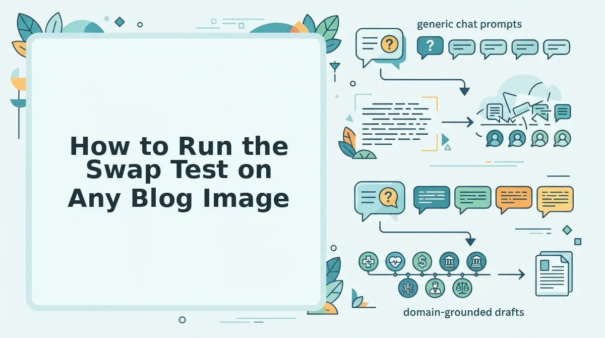
Run the Swap Test by asking four pass/fail questions about each image: subject match, claim support, consistent treatment, and descriptive alt text. The core rule: if the image could sit on any other article unchanged, it is decorative and fails.
That swap question is the one most teams never ask. Before starting, open the post in your CMS and keep your site's art direction notes nearby. Plan on about two minutes per image.
- Check subject match. Look at the image and ask: does it show this article's subject? It passes if a reader could guess the topic from the image alone and fails if it shows a generic desk or abstract shape.
- Check claim support. Read the paragraph beside the image and ask: does it clarify a specific point in the text? It passes if removing it would make that point harder to follow.
- Check consistent treatment. Compare the image against your art direction notes and ask: does it follow the site's palette and framing? It passes if it looks like it belongs with your other images.
- Check descriptive alt text. In WordPress, select the image block and open the Alternative text field in the sidebar. Ask: does the alt text describe what the image shows? It passes with a plain description and fails if empty or stuffed with keywords.
Now run the audit on the Indexing API intro image. The laptop-and-coffee photo fails step 1 because it shows no service account, fails step 2 because it clarifies nothing in the setup instructions, and fails step 4 when its alt text reads like "Google Indexing API SEO tool laptop."
The setup-flow image passes all four. It shows the subject, illustrates the steps being explained, follows the site's palette, and carries alt text such as "Google Cloud console screen for creating a service account."
Stock photos are not the problem in themselves. A stock image that passes all four questions counts as editorial.
How to check it worked: every image in the post passes all four questions, and none could be swapped onto another article unchanged.
Once you can spot failures, the next step is choosing which editorial image each article needs.
Which Editorial Image Fits Each Type of Article?
Match the image to the article type. How-to posts need a process diagram, comparisons need a side-by-side, opinion pieces need a scene, and technical posts need an annotated screenshot. If you choose the image type first, the Swap Test confirms a good choice instead of catching a bad one.
| Article type | Editorial image type | What the image must show | Decorative trap to avoid |
|---|---|---|---|
| How-to | Process diagram | Each step in order, ending with the finished result | Stock photo of hands typing on a laptop |
| Comparison | Side-by-side | Both options, measured on the criteria the post compares | Generic business handshake |
| Opinion | Scene | The real situation the argument is about | Abstract lightbulb "idea" art |
| Technical | Annotated screenshot | The exact screen or output, with callouts on what matters | Abstract glowing-code backdrop |
- How-to: Best for solo operators writing tutorials that readers follow step by step.
- Comparison: Best for growth leads writing content for readers who are evaluating options.
- Opinion: Best for founders writing point-of-view essays.
- Technical: Best for content publishers who cover tools, APIs, and configuration.
Decorative graphics still have a role. A branded header pattern is quick to produce and builds visual recognition in feeds and social previews. Use one for the featured slot if you want, but don't let it replace the image that explains the content.
Write the image type into your SEO content brief. That way the writer and the designer agree on it before production starts.
How to Keep Editorial Style Consistent Across Every Post
Write your image rules into the same Markdown brand context file that holds your voice rules. A consistent style then comes from one shared document, not from each designer's memory. Before you start, you need three things: that context file, a text editor, and one published post to test against.
- Open your brand context file and add an "Image Rules" heading directly below the voice rules (2 minutes). Voice and image rules should now sit in one file.
- Type your palette as exact hex codes, along with how often each one may appear (5 minutes). The rule should be specific enough that two people would pick the same colors.
- Define framing: the aspect ratio, where the subject sits, and how close the crop is (5 minutes).
- Map each article type to its image type from the matrix above (5 minutes). Every post format should now have a default image type.
- List banned clichés by name, such as handshakes, lightbulbs, and code backdrops (5 minutes).
- Test the rules on one existing post (10 minutes).
Worked example #3: Take the Indexing API post and rebuild its image with these rules. The matrix routes it to "technical," so it gets an annotated screenshot of the request and its response. The colors come from the palette rule, and the code backdrop is ruled out by the banned list.
Written style rules make image consistency automatable because they turn taste into instructions. A designer's intuition cannot be handed to software, but a rule such as "technical posts use annotated screenshots in these three hex colors, never abstract code art" can. Once palette, framing, subject types, and banned clichés are written down, any system that reads the file can apply them the same way on the first post and the fiftieth. Consistency stops depending on who made the image that day.
The AI SEO content engine BloGoose reads this context file and applies the rules while it drafts and creates images. It then publishes to WordPress or your custom API, so nobody has to hand-format image assets.
- Image looks generic: Rerun step 1 of the Swap Test.
- Style drifts between posts: Tighten the rules in the context file.
- Image contradicts the text: Recheck that the post actually supports the claim the image shows.
If formatting images by hand is what slows your publishing, let automated SEO content apply your rules to every post.
Make Every Image Earn Its Place
An image earns its place when removing it would cost the reader information. That is the payoff of the Swap Test: a decorative graphic can be swapped for any other without loss, and an editorial image cannot.
Turn that principle into a habit with three moves:
- Audit: Run the Swap Test on your three highest-traffic posts.
- Match: Choose each replacement image type from the matrix.
- Codify: Write your style rules into your brand context file.
Then write descriptive alt text for each image. It helps screen-reader users, and it gives answer engines text they can extract and quote. This is how AEO content optimization extends to your visuals.
To make this run on autopilot, drop your domain into the BloGoose setup wizard. It will plan, draft, illustrate, and publish posts in which every image does real work.