Mobile-first indexing means Google uses the mobile version of your content, crawled with the smartphone agent, for indexing and ranking. Responsive design is the configuration Google recommends: the same HTML and the same URL, with the layout changing to fit the screen. Google’s mobile-first indexing best practices, updated 10 December 2025, still describe three setups. Only two of them need a long parity checklist. A blog that already serves one document does not start an m-dot project in 2026.
Serve one HTML document on one URL, and put the article in that document. Google indexes the smartphone crawl. On a responsive site, that crawl is the only page. A separate mobile URL has to repeat the article, the title, the structured data, and the robots rules, with the desktop URL as the canonical.
What mobile-first indexing is
Most of Google’s crawling for Search is done with the mobile smartphone agent. Desktop Googlebot may still crawl sometimes. The indexed copy is the one the phone received. A site is not required to have a mobile version in order to be included in Search. Google strongly recommends one, because more people use phones, and because the smartphone crawl is what Search uses. A desktop-only template that the phone can barely read is still a page. It is a worse page for the people on that phone, and it is the page Google is indexing.
The March 2020 announcement said Google would switch the whole web to mobile-first indexing starting in September 2020. The current best-practices page still includes troubleshooting for a site that is not on it yet, so this guide will not claim that every hostname finished on the same day. The job has changed. It is not a future migration you schedule. It is: the smartphone version is the one that matters, and a responsive site already is that version.
There is no special schema that turns mobile-first indexing on. There is no tag that opts a URL in. The signal is the HTML the smartphone agent can fetch. If that HTML is the article, you are done with the configuration. The rest of the work is ordinary page quality: a useful document, a real title, and images that are the images, which the image SEO guide covers.
Responsive design is the setup
Google names three ways to build a mobile site. Responsive design uses the same HTML on the same URL and changes the layout with the screen. Dynamic serving uses the same URL and sends different HTML depending on the user agent, and it needs a Vary: User-Agent header so caches do not store the wrong copy. Separate URLs serve different HTML on different addresses, often an m. host, and each desktop URL corresponds to a different mobile URL.
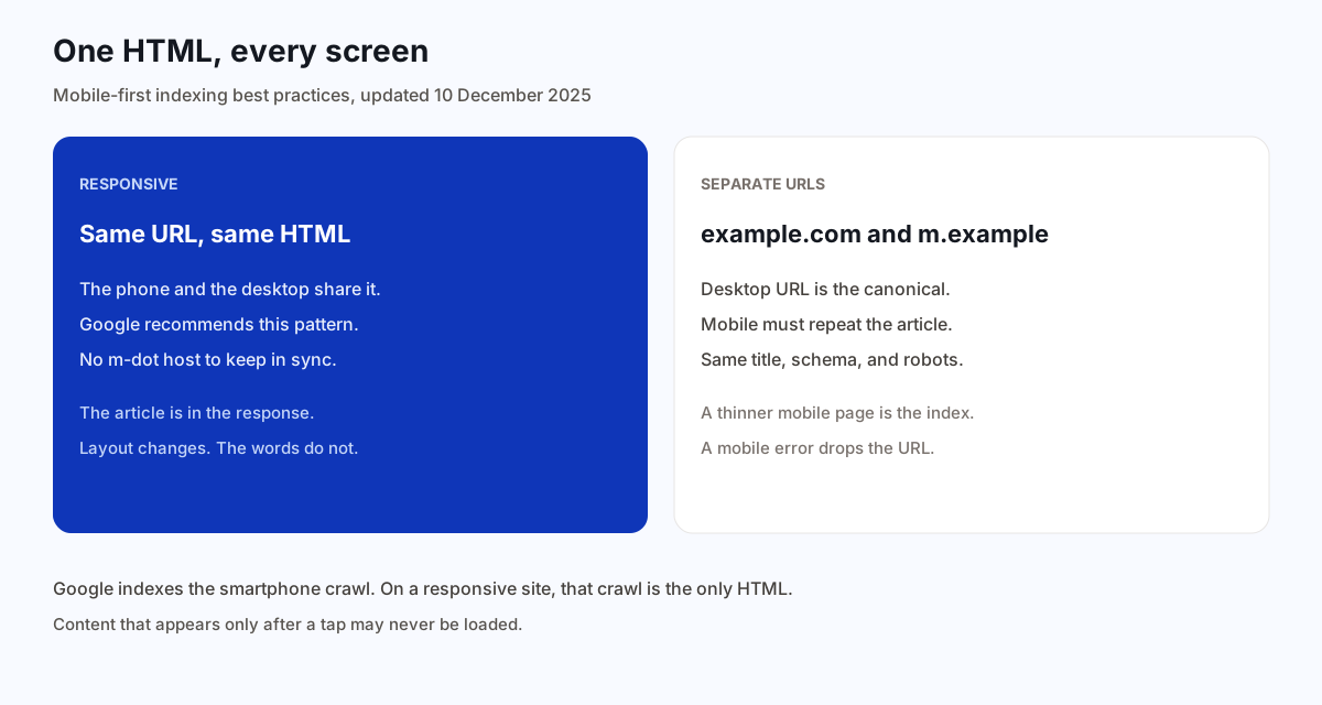
Google says the detailed checks in that guide apply to dynamic serving and separate URLs. On a responsive site the content and the metadata are already the same, because there is only one response. That is why responsive design is easier to keep. You do not maintain a second title, a second canonical, or a second robots rule. You maintain one article and a layout that fits a narrow screen.
| Setup | What the phone gets | What you maintain |
|---|---|---|
| Responsive design | The same HTML as the desktop, on the same URL | One document. Layout changes with the screen. Google’s recommendation. |
| Dynamic serving | Different HTML on the same URL, chosen by user agent | Vary: User-Agent, and the mobile HTML has to match the desktop article. |
| Separate URLs | A different address, often an m-dot host | Desktop is canonical. Mobile is the alternate. Every field has to stay in sync. |
A phone that is sent from the desktop host to an m-dot host waits on that extra response before the article. Responsive design skips the hop. The redirects guide is for a URL you retired. It is not a reason to bounce every phone visitor to a second host. If you already redirect phones that way, the rest of this page is the cost of keeping that second host correct.
The phone copy is the indexed copy
Google indexes what the smartphone crawl can see. If the mobile version has less content than the desktop version, Google has less to index, which can cause a loss of traffic. The warning is aimed at sites that ship a shorter phone page on purpose. A responsive article does not have a shorter phone page. The same headings and the same steps are in the HTML. CSS may stack them. It should not delete them.
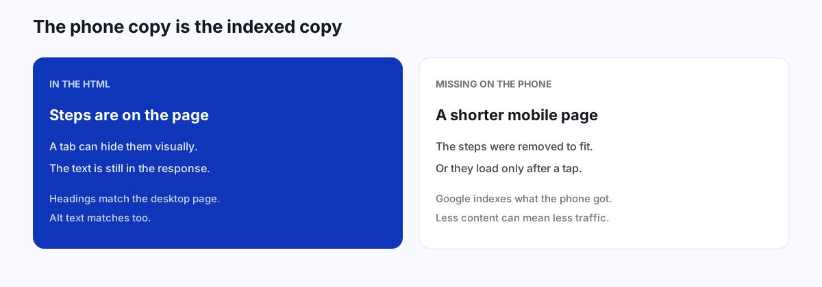
Accordions and tabs are allowed when the content is equivalent. The mobile-first page says this is fine, because indexing uses the mobile rendering, and the content is the same. A heading inside a collapsed section can still be a heading. What is not fine is primary content that appears only after a person swipes, clicks, or types. Google will not load content that requires that interaction. A “read the steps” control that fetches the steps on tap leaves the indexed copy without the steps. The JavaScript SEO guide is the same rule from the rendering side: the article belongs in the HTML response.
Lazy-loading images below the fold is a separate choice, and the image guide is where width, height, and the first screen belong. Do not extend lazy-loading to the article text. The words are not a decorative asset you can defer until a tap.
If you already have a separate mobile URL
If the site is one responsive URL, you can skip the m-dot migration. The rules in this section are for a site that already serves a different address to phones, or that sniffs the user agent and swaps the HTML. Building that setup now, for a blog, adds a second page you must keep identical. Google’s recommendation is not to start there.
Each desktop URL should have its own mobile URL. Do not redirect many desktop pages to one mobile page, and do not send them to the mobile homepage. A phone that asked for a specific guide and lands on a menu has not reached the guide. That is the same mistake as sending every missing URL to the homepage, which the soft 404 guide covers from the status-code side.
On a separate-URL setup, the desktop URL is always the canonical. The mobile URL is the alternate, with a media query that describes the mobile screen. The mobile page points its canonical at the desktop URL. Do not canonicalize the desktop page at the mobile URL, and do not give both pages a canonical to themselves as if they were two articles. They are one article at two addresses. Canonical tags are the hint. The desktop address is the one Google asks you to prefer in this configuration.
Hreflang has to follow the same split. Mobile hreflang links point at the mobile URLs, including the self reference. Desktop hreflang links point at the desktop URLs. A mobile page that lists the desktop English URL as its English alternate has mixed the two hosts. The hreflang guide is the return-link rule. This is the extra case: when the mobile page is a different URL, its alternates are the mobile ones. A responsive site does not have that split, because there is one URL per language.
Avoid fragments on the mobile URL. Google’s page says a fragment, the part after a hash, is not a supported way to represent the mobile version. Use a real path. The JavaScript guide already says not to load different pages from fragments. An m-dot site that puts each article at m.example.com/#/async-standups has the same problem.
Titles, robots, and structured data
When two URLs exist, the title element and the meta description should be equivalent. A shorter mobile title that drops the topic, or a mobile description that is a slogan, is a different snippet from the page you wrote. The title guide is how to write the one title. On a separate mobile URL you copy that title across. On a responsive URL you only have it once.
The robots meta tags have to match, especially the indexing rules. A mobile page that says not to index, while the desktop page is indexable, can drop the URL, because the smartphone crawl is the one Search uses. The robots meta guide is the tag itself. The mobile-specific failure is putting that tag on only one of the two versions. If you do not want the article indexed, say so on both. If you do, say so on neither.
Structured data should match as well. If you must prioritize, Google says to start with Breadcrumb, Product, and VideoObject. URLs inside the mobile markup should be the mobile URLs. A mobile page whose breadcrumb schema points only at desktop paths is describing a trail the phone did not use. The article schema guide is the rule that the markup repeats the visible headline, author, and dates. On two URLs, both copies have to tell that same story, with addresses that belong to the version they are on.
Dynamic serving has one more header. Vary: User-Agent tells caches that the HTML depends on who asked. Without it, a cache can store the desktop HTML and hand it to a phone, or the reverse. Responsive design does not need that header for this reason, because the HTML does not change with the agent. A viewport meta tag still belongs on the responsive page so the browser lays the one document out at the device width. The viewport is layout. It is not a substitute for having the article in the HTML.
Images, video, and ads
Images on the mobile version should be the ones the page needs, in a supported format, with the same alt text as the desktop version when the picture is the same. Google supports inline SVG. It cannot index a JPEG that is nested in an image tag inside that SVG. If the picture has to be an image result, use a normal image element. The image guide is filenames, dimensions, and alt text. The mobile-specific point is parity: a tiny stand-in on the phone, with different alt text, is a different image in the indexed copy.
Google also says to use the same image URLs on both versions when you can. Different URLs can cause a temporary loss of image traffic while the new URLs are processed. Do not use an image address that changes on every request. A cache-busting token that is new each crawl looks like a new file.
Videos should use a supported tag, such as video, embed, or object, sit where a person can find them without a long hunt, and use the same video structured data. A video URL that changes every time the page is crawled is the same instability as a changing image URL. This is not a video-SEO program. It is: if the desktop page has the clip, the mobile page has the clip, in markup a crawler can see.
Ads have to follow the Better Ads Standard. A block of ads at the top that uses up the phone screen pushes the article down. The mobile-first page calls out ads that take too much room. A responsive article can include a normal placement. It should not open with a screen of ads and the first paragraph below the fold on every phone.
Errors, fragments, and one mobile homepage
Error status has to match. If the desktop URL returns 200 and the mobile URL returns an error page, the page can drop out of the index. A phone crawl that receives an error is not “the desktop page, slightly worse.” It is a missing page. Fix the mobile URL so it returns the article, or stop sending phones to a host that fails. A soft error page that says the article is missing while returning 200 is still the soft-404 problem.
The mobile host also has to have enough capacity. Google notes that a separate mobile site needs room for the crawl that now prefers it. On a very large site that is already at its limit, that is a crawl budget question: hostload is shared, and a slow mobile host lowers what gets fetched. A small blog on one responsive URL does not create a second host to capacity-plan. If phones are fast and the HTML is the article, you are outside that project.
Robots.txt rules should match in most cases. Blocking the smartphone agent from a path the desktop agent may fetch does not hide the URL in a clean way, and it can leave Google with the wrong copy. If a path should not be crawled, say so for the agents that crawl it. The robots meta guide is the indexing decision, which still requires a fetch. Do not invent a mobile-only disallow and call it a mobile strategy.
Verify both properties in Search Console if you really have two hosts. A responsive site is one property. An m-dot host is another. Looking only at the desktop property hides whether the phone URLs are indexed, redirected, or erroring.
A responsive example
Northwind publishes /async-standups once. The HTML includes the steps, the headings, the title, and the images. A phone and a laptop request that URL and receive that document. CSS stacks the layout. Nothing fetches a second article from m.northwind.example. There is no canonical split, because there is no second URL. An accordion can collapse a long example, and the example text is still in the response before anyone taps.
They do not sniff the user agent to delete sections on a phone. They do not redirect the phone to a homepage “app.” A person who opens the standup guide on a phone reads the standup guide. The smartphone crawler receives the same words.
If they had inherited an m-dot host, the desktop URL would stay canonical, the mobile URL would be the alternate, the titles would match, and a mobile error would be treated as an outage of that guide, not as a styling bug. They would not add that host in order to look mobile-friendly. The responsive URL already is.
How this shows up in a published article
BloGoose publishes one HTML article to the URL you chose. The public pages are one document, laid out for the screen, not a second site for phones. The indexing question is whether that document contains the piece: the headings, the steps, and the images with their alt text. A theme that hides the body until a tap, or that serves a thinner page to a phone user agent, would throw away the copy Google indexes. Keep the article in the response. Let the layout reflow.
You do not add a mobile canonical, a mobile sitemap, or a mobile-only title for a page that has one URL. You would add those only if you deliberately ran a separate mobile host, and this product does not ask you to. Page experience on a phone is still real: the text has to be readable without sideways scrolling, and the first screen should not be a wall of ads. That is layout. It is not a second article.
Questions about mobile-first indexing
What is mobile-first indexing?
Mobile-first indexing means Google uses the mobile version of a page, crawled with the smartphone agent, for indexing and ranking. A responsive site serves that version to every device from one URL. A separate mobile URL has to carry the same article.
Does a site need a separate mobile URL?
No. Google recommends responsive design: the same HTML on the same URL, laid out for the screen. Dynamic serving and separate URLs are the other configurations, and they need extra parity rules. A blog can stay on one URL.
What happens if the mobile page has less content?
Google indexes the mobile version. If that version omits the article, Google has less to index, and the page can lose traffic. Accordions and tabs are fine when the same content is in the HTML. Content that appears only after a tap or swipe may not be loaded.
Which URL is canonical on an m-dot site?
On a separate-URL setup, Google says the desktop URL is the canonical and the mobile URL is the alternate. Mobile hreflang links point at mobile URLs, and desktop hreflang links point at desktop URLs. Responsive sites do not need that pair.
Should mobile and desktop use the same title?
Yes, when you keep two URLs. The title element and the meta description should be equivalent, and so should the structured data, the robots meta tags, and the image alt text. A responsive page has one copy of each.
Can ads or a missing mobile page remove a URL?
A mobile URL that returns an error, or that is noindex, can leave the page out of the index even when the desktop URL is fine. Several desktop URLs must not redirect to one mobile page or to the mobile homepage. Ads that fill the phone screen are a page-quality problem Google calls out.
One HTML document. The phone layout changes. The article stays in the response.
Start the 1-day trial